What to put in your website menu navigation
September 23, 2021
Did you see this?
Get instant access to our free training "The 6 Things your Website needs so you get more Customers" 👇
The primary purpose of your website menu navigation is to allow website visitors to search for and find the information they are looking for with ease. What you put in your website navigation menu should be easy to understand and use, with links that go to the most important pages on your website.
94% of consumers say they want an easy to navigate website. You want to create a streamlined user experience. Is your WordPress website menu helping or overwhelming your visitors?
Here's what your website menu should have:
Link to your most important pages in your top menu
In order to capture your visitor's attention, your main navigation should be visible. Typically this should include; home, about, contact, services, products and a blog.
You can choose to remove the word “home” and just link the logo to the home page. Whether you do this or also have the word home, this allows users to always have access to their starting point.
In your footer menu or menu at the bottom of your site, you can show things like privacy policies. If your website has a lot of information, it might be helpful for people to use the footer to find other useful and important links you can’t fit into the main top website menu navigation.

Simplify the pages and paths you link to
In the context of user experience, simplicity is key. Combine topics or use further navigation paths, like junction boxes, or visual next steps, on your core pages. The primary goal of your menu navigation is to allow website visitors to search for and find the information they are looking for quickly and easily.
Think about what your customers need and move what they don’t to the footer menu. You can use Google Analytics to review your top visited pages or a heatmap tool like hotjar.com to see what people are clicking on.
Use submenus to help people get to specific topics faster
Try to limit your dropdown submenu to only go one level deep. Keeping it to a minimum will allow your website visitors to quickly find what they are looking for.
However, if you have a lot to share, like with an eCommerce site, try a mega menu. Mega menus are a great way to present a navigation system when you have a large amount of menu items. A mega menu is essentially a large dropdown menu that displays a collection of categorised links.

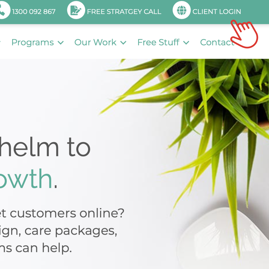
Highlight important support pages in a secondary top menu
Consider your demographic and current customers. What do they need to contact you? You can use a contact bar at the top of your menu that will allow your visitors to get in touch with you either by phone, email, and whatever other options you choose to include.
Do you have a member’s or customer’s area that requires a login? You can put this at the top where you can add things that won’t be used by all visitors and make it easy for your clients to find.
You might need a different mobile version of your menu 📲
- In order to create a great user experience, make sure to test on a phone.
- Best practice is using a hamburger menu. The hamburger icon is a universal symbol for a menu on mobile.
- If you have customer logins or booking buttons, move them out of the menu so they sit above and can easily be clicked. No one wants to deal with the frustration of trying to navigate through a tiny menu or a menu with too many links.
Set up your menu to get leads
Lastly, remember your menu is your greatest tool to help guide new visitors to take the first, or next, step with you.
Here are a couple of quick tips to use your menu to get leads and build your email list.
It is crucial to make sure that your website is accessible and easy-to-use for all of your visitors. If you are unsure where to start, we are happy to review your menu and other areas that might stop visitors from being customers.
